Bar Chart
This chart is standard for plotting several measures for multiple categories. It excels for use with categorical data variables such as speaker_name, gender, office_location, age, and tenure, among others. It works well when comparing how categorical variables score across framework measures.
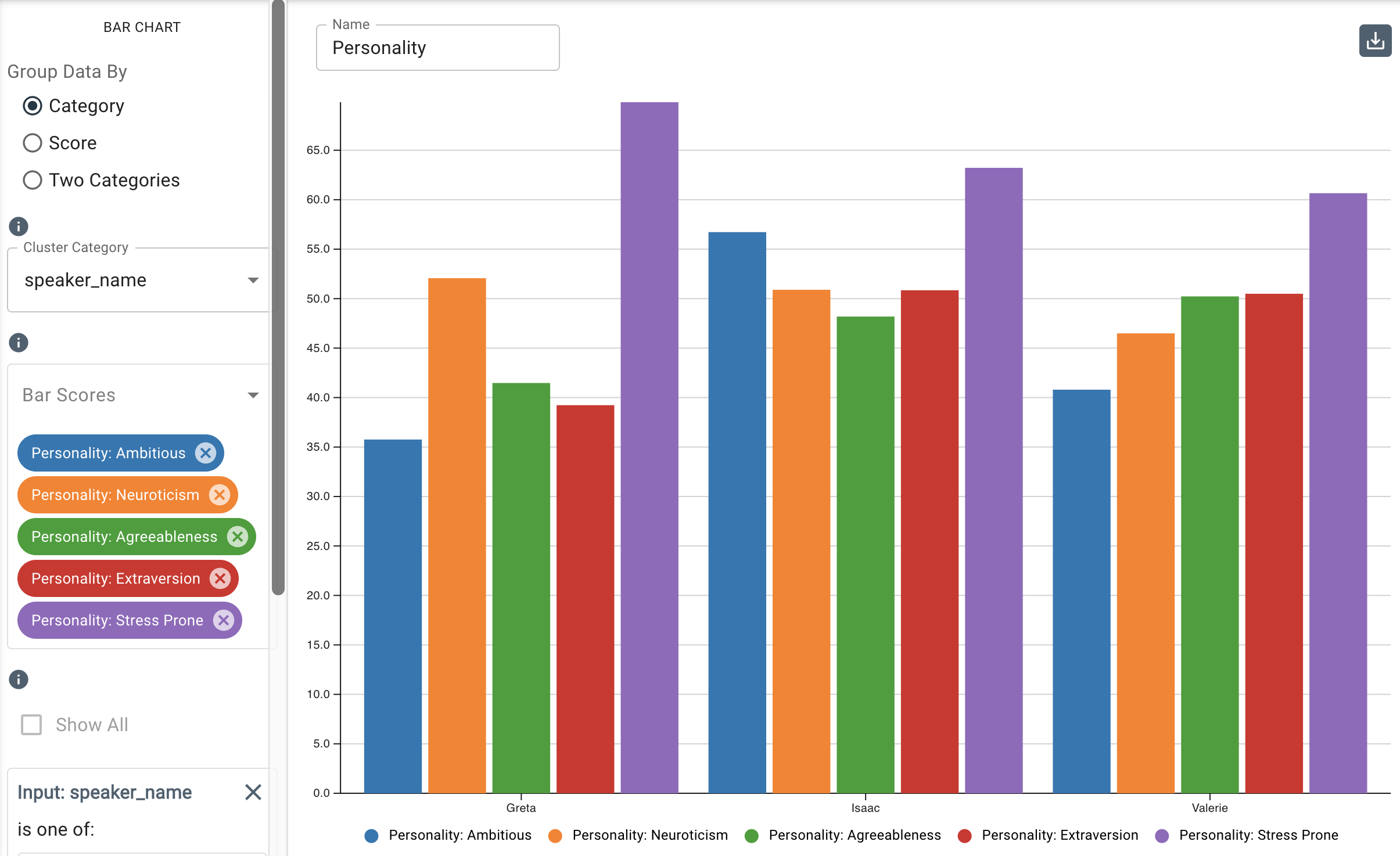
The bar chart allows you to gain nuanced insight into categorical groups of interest by helping to discern how varying geographic, demographic, or organizational groups within an organization feel about key themes, or compares how multiple speakers on a call score on a selection of Big 5 measures, for example.
Parameters
-
The Group Data By buttons allow you to select among the following:
- Category: Plots the bars based on categorical input data, such as
speaker_name,speaker_id, or any category your dataset is labeled with. Lists the colour-coded measures below in the legend. - Score: Plots the bars based on the score(s) derived from the selected measure(s) and lists the colour-coded categorical inputs below in the legend. The Score option is useful for analyzing and visualizing the distribution of scores across different categories.
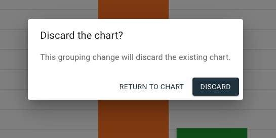
- Two Categories: Plots any two input data categories filtered on a chosen measure. Note that a bar chart created using either Category or Score will be discarded to create a Two Categories chart, as seen in the dialogue that appears when clicking Two Categories:
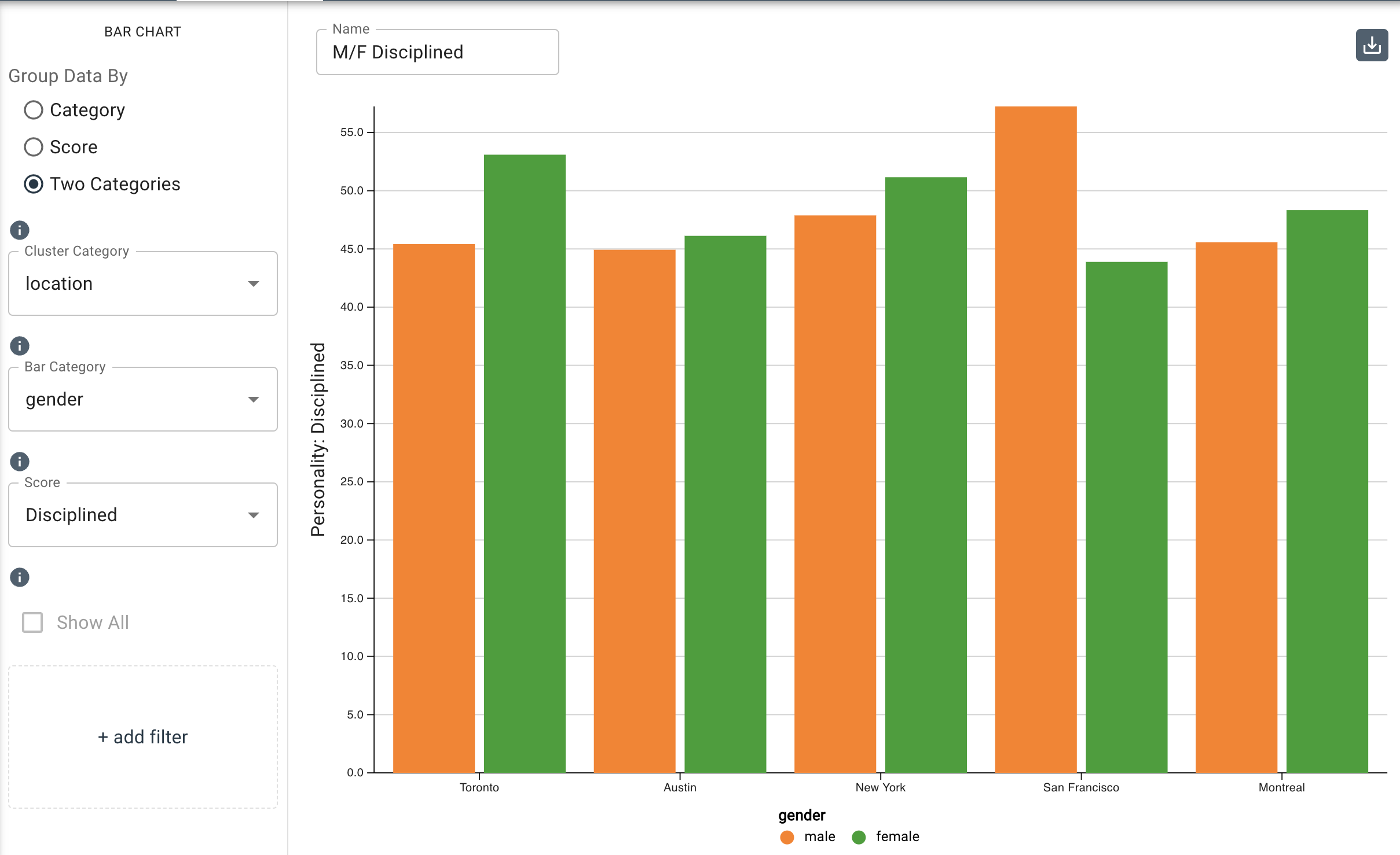
In the example below, the Two Categories option is used to display the disciplined measure in the Big 5 Personality framework within age distributed by office location.
- Category: Plots the bars based on categorical input data, such as
-
The Cluster Category drop-down menu allows you to select the input value to cluster the bars with.
-
The Bar Category drop-down menu allows you to select the input value to aggregate the chart’s data with.
-
The Score drop-down menu allows you to select the measures you want to use to get scores for. The measures are organized by framework and are listed alphabetically. Note that you can search for a measure by typing it in the field provided at the top of the drop-down menu.
-
The Add Filter option allows you to further filter by categorical input data. For example, if you wanted to filter by gender in the example above for the Two Categories bar chart, you would click Add Filter, then select a category to filter by, then select Female to display the same results but filtered by only female employees.

-
Under
Additional Configurations, you will findOverride Axis Ranges. This tool allows you to toggle between Fit to Data and Custom. By choosing Fit to Data (the default setting), the chart will scale to the upper and lower ranges of the data plus a small buffer. Choosing Custom enables you to customize the y-axis range.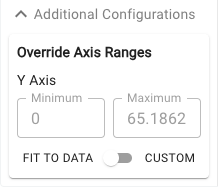
Customizable axis ranges provide flexibility to zoom in and view your data in greater detail, making it easier to analyze patterns that might otherwise be missed. Zooming out allows you to standardize the scale across multiple charts, which is especially useful in views such as dashboards where you want to compare different datasets on a consistent scale. This feature gives you control over how your data is presented, ensuring that key insights are clear and accessible.