Emotions by Topic
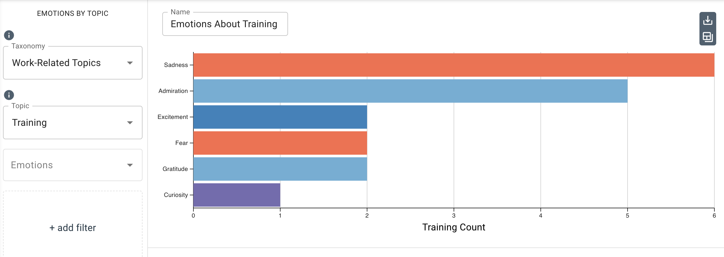
This table measures emotions found within text about a taxonomy topic. Emotions display in descending order of occurrence and are optionally filtered by categories such as speaker_name, speaker_id, or any category your dataset is labeled with. Emotional valence and intensity are represented by color.
This chart works best with a dataset that includes references to key topics of interest, such as a survey about remote work or a meeting about employee wellbeing. It can help to identify the emotions expressed when a topic is mentioned and compare how often emotions are expressed when a topic is mentioned.
Parameters
-
The Taxonomy drop-down menu allows you to select the taxonomy (dictionary) that contains the topics to filter by.
-
The Topic drop-down menu allows you to select the topic within the taxonomy to display in the chart.
-
The Emotions drop-down menu allows you to select any emotion(s) you want to display in the chart.
noteIf no emotions are selected, this chart displays the top 10 emotions ordered by occurrence.
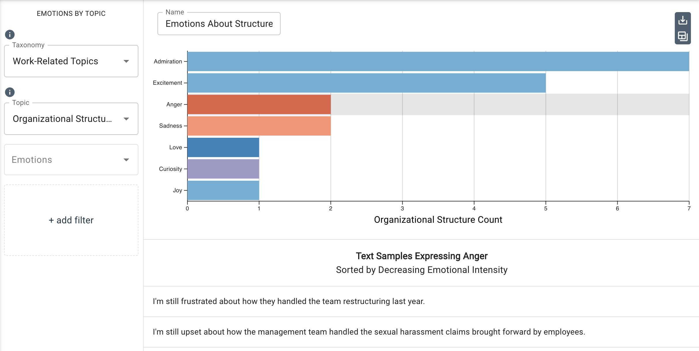
You can view the text samples in a dataset that expressed a SALLEE emotion and discussed a topic in the chosen taxonomy. Simply click the horizontal bar associated with the topic you want to see the sample for, and the sample will display below the bar chart, sorted by decreasing relevance. In the image below, Anger is selected, as indicated by the shadow spanning the its horizontal bar. The chart populates the emotions that were most present in descending order of emotional intensity.
-
Under
Additional Configurations, you will findOverride Axis Ranges. This tool allows you to toggle between Fit to Data and Custom. By choosing Fit to Data (the default setting), the chart will scale to the upper ranges of the data plus a small buffer. Choosing Custom enables you to customize the x-axis range.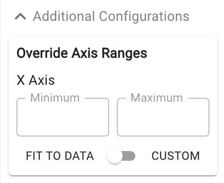
Customizable axis ranges provide flexibility to zoom in and view your data in greater detail, making it easier to analyze patterns that might otherwise be missed. Zooming out allows you to standardize the scale across multiple charts, which is especially useful in views such as dashboards where you want to compare different datasets on a consistent scale. This feature gives you control over how your data is presented, ensuring that key insights are clear and accessible.
noteNegative values are disallowed for this chart type.