Heatmap
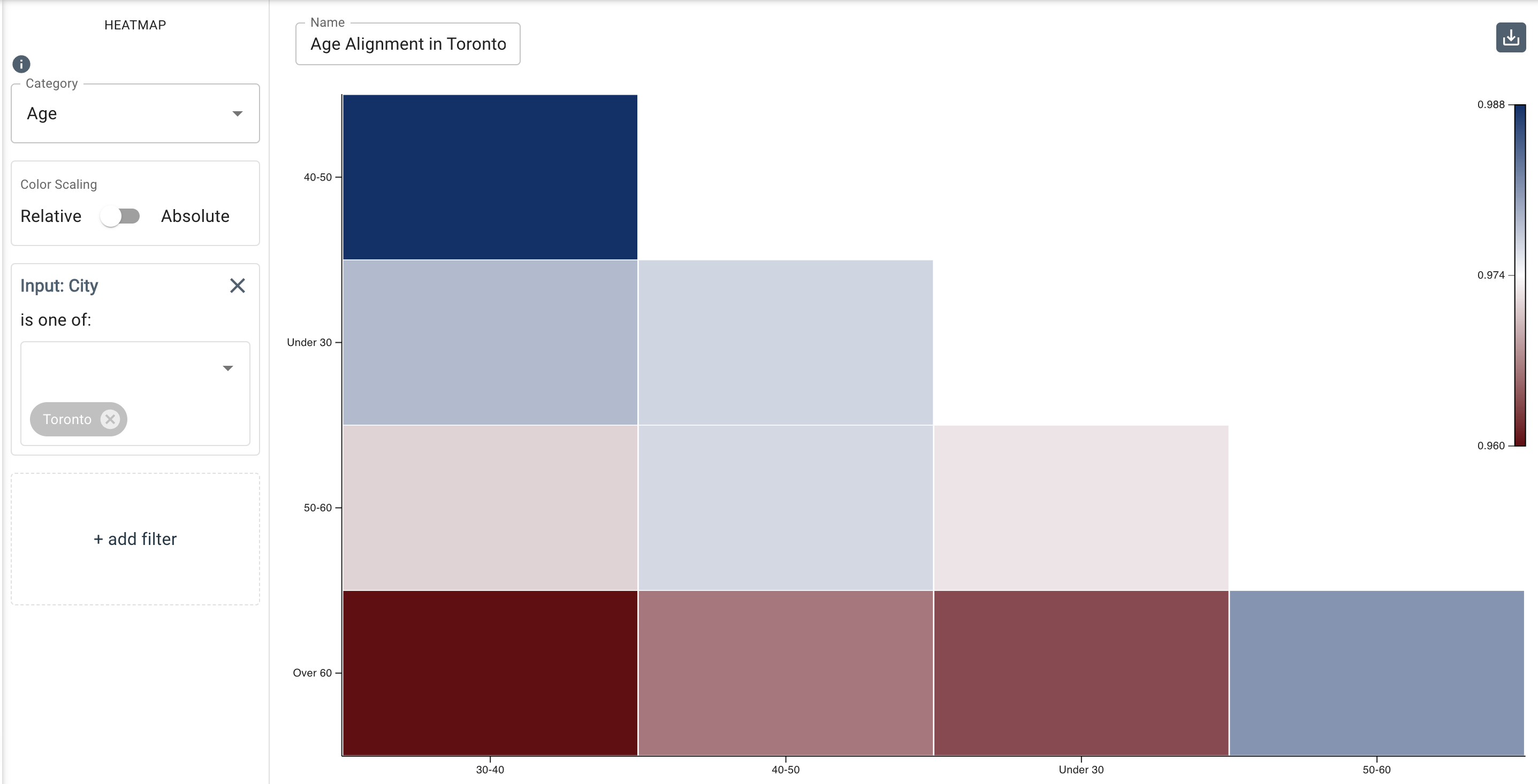
This chart allows you to visualize the magnitude of Language Style Matching (LSM) between groups for any selected category, most typically between three or more verbose speakers. Magnitudes are represented by a range of colored cells. This chart is an effective way to provide an overview of rapport/alignment between individuals or groups and can help to highlight misaligned individuals.
It can also be used to represent multiple groups of people, such as for comparing different departments across organizations, or different office locations, ages, tenures, or gender, among others.
Parameters
- The Category drop-down menu allows you to select the input category whose members you want to compare.
- The Relative/Absolute toggle button allows y ou to choose between the two separate colour scaling options. Absolute uses the absolute value of each data point to determine its colour, while relative colour scaling uses the value of each data point relative to the other values in the heatmap to determine its colour.
- The Add Filter tool allows you to filter by input categories (
city,age,gender, etc.). In the example above from the UI image, the age ranges within an organization are measured for their linguistic alignment, and it’s filtered down specifically to the Toronto office instead of displaying the alignment of the company as a whole.