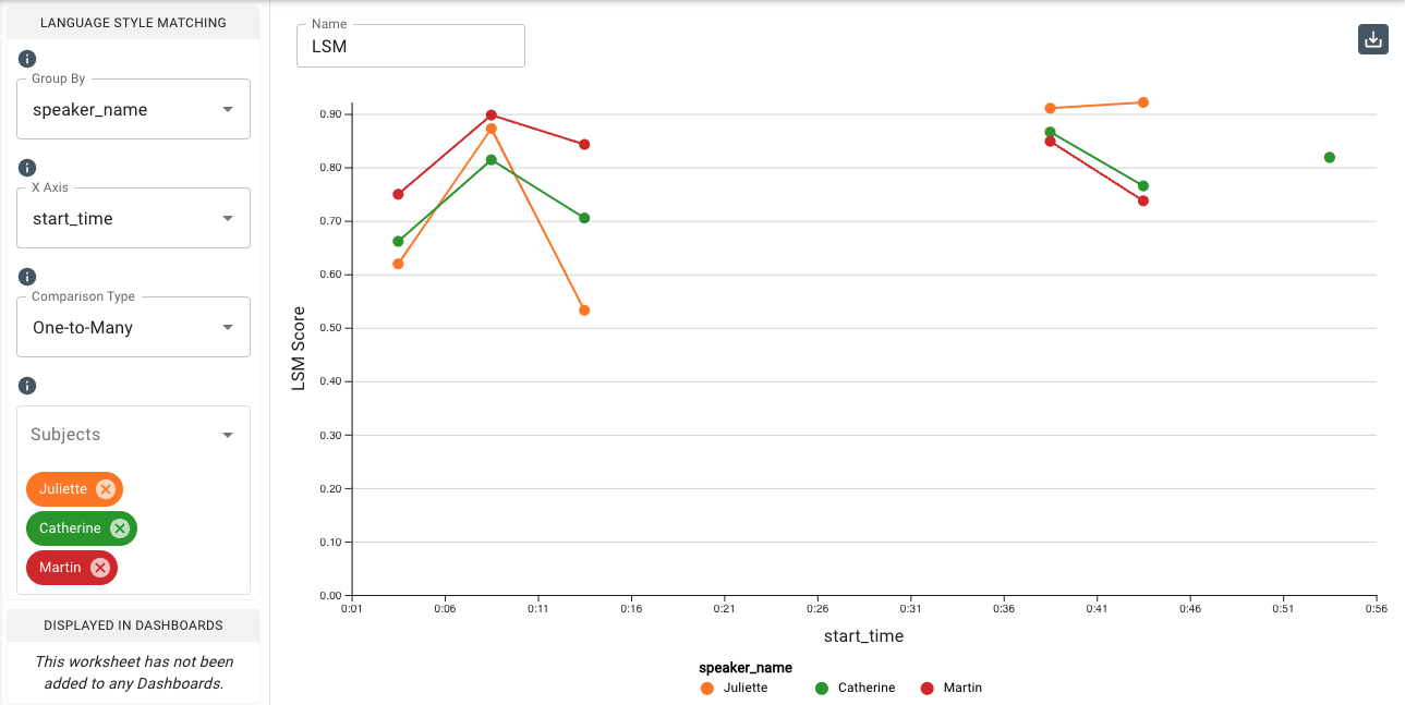
Language Style Matching Chart
This chart allows you to measure the magnitude of language style matching (LSM) that occurs between two or more people from a conversation transcript. Language style matching is highly predictive of a wide range of interpersonal outcomes and behaviors. When people in a conversation are paying attention to one another, their language tends to mirror one another’s. This process is similar to that which occurs with physical mirroring, but is more subconscious. LSM occurs at the grammatical level, and is calculated by measuring the similarity between the use of function words between two or more people. LSM can be measured in a simple conversation between two people, or in a setting as varied as an entire subreddit community.
The Heatmap chart also features LSM between two or more people. It provides a visual sense of what the mean LSM is for a particular dataset and how variant the pairwise scores are, though because it does not require a datetime column in the dataset it will not display LSM data related time segments of a transcript. It looks at the whole dataset as one snapshot.
The LSM chart allows you to explore in further detail the dynamic aspects of LSM occuring throughout a conversation, and allows you to compare trends. You can split a transcript and look at data a slice at a time, giving you the ability to see the highs and lows of people's LSM over time. Some LSM insights can be drawn from patterns rather than just overall scores. For example, if a speaker says something divisive that alienates other speakers, there may be a widening LSM for a period of time between the group or between individuals in the group. Or, if all speakers are coming to a consensus, there may be a convergence over time. In terms of measuring LSM, the line graph excels in these scenarios where more time-based and inter-group comparisons are needed.
The LSM chart requires that an uploaded dataset contain a datetime component so that it can map LSM to time segments on the chart.
When to Use Pairwise LSM vs. One-to-Many LSM
Pairwise: Use this when measuring the LSM between individual people within a group. For example, Person 1 vs. Person 2, Person 1 vs. Person 3, or Person 2 vs. Person 3, etc.
One-to-Many: Use this when measuring the fit of each individual within a group. For example, Person 1 vs. the average of Person 2 and Person 3, or Person 2 vs. the average of Person 1 and Person 3, etc.
Parameters
-
The Group By drop-down menu allows you to set the column to use to group the chart’s data by selecting either the overall dataset or by a category such as
speaker_name,speaker_id, or any category your dataset is labeled with. -
The X-Axis drop-down allows you to select the column from your dataset to use to populate the x-axis of the chart.
-
The Comparison Type drop-down allows you to select between the two methods of calculating language style matching:
- Pairwise charts LSM in relationships between individual people within the transcript.
- One-to-Many charts LSM related to how each person fits within the whole group.
-
The Subjects drop-down allows you to select a category to compare to the rest of the dataset, such as
speaker_name. In the case of speakers in a transcript, selecting a speaker in this menu will plot that speaker on the y-axis, with low LSM at the bottom of the axis and high LSM at the top. The speaker(s) chosen in the Partners drop-down below will be plotted with their LSM scores in relation to the Subject throughout the timeframe of the transcript. This menu also contains the the Averages option, which computes and displays the LSM Group Average. -
The Segment By drop-down allows you to break out the x-axis into a number of segments to display an average value. The Receptiviti UI calculates the beginning and end measurements within the featured dataset to determine which series of segments to display.
-
The Segment Interval drop-down allows you to adjust the division and granularity of the segmentation.
-
The Add Filter tool allows you to filter by input values and select individual speakers/participants or smaller subsets of participants. To do so, select an input value in
Filter Fieldsuch asspeaker_nameand choose the individual(s) from the list underis one of. -
Under
Additional Configurations, you will findOverride Axis Ranges. This tool allows you to toggle between Fit to Data and Custom. By choosing Fit to Data (the default setting), the chart will scale to the upper and lower ranges of the data plus a small buffer. Choosing Custom enables you to customize the y-axis range.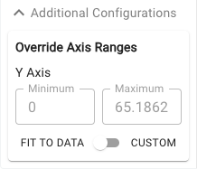
Customizable axis ranges provide flexibility to zoom in and view your data in greater detail, making it easier to analyze patterns that might otherwise be missed. Zooming out allows you to standardize the scale across multiple charts, which is especially useful in views such as dashboards where you want to compare different datasets on a consistent scale. This feature gives you control over how your data is presented, ensuring that key insights are clear and accessible.