Line Chart
This chart works well for call transcripts as it plots single measures over time for multiple speakers, allowing you to gain insights into how a person or group of people varied emotionally and psychologically throughout the duration of a conversation.
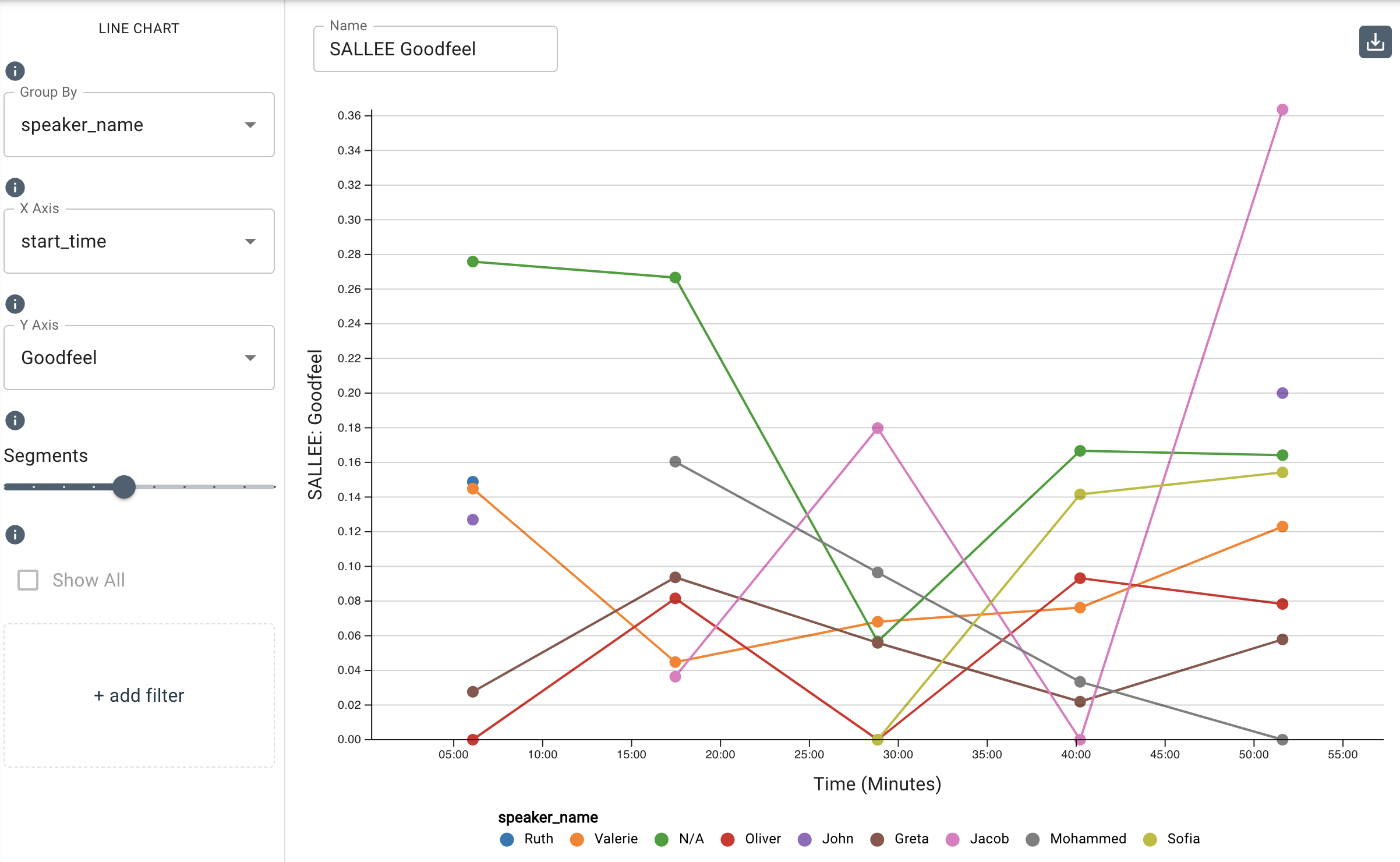
The line chart below uses the SALLEE measure Goodfeel which tracks overall positive emotion. Emotion scores (including scores Goodfeel, Badfeel, and Ambifeel) will always fall between 0.0 and 1.0. Goodfeel, Badfeel, and Ambifeel will allow you to differentiate between degrees of negative, neutral, or positive emotions based on the scoring.
Parameters
-
The Group By drop-down menu allows you to set the column to use to group the chart’s data by selecting either the overall dataset or by a category such as
speaker_name,speaker_id, or any category your dataset is labeled with. Note that you can type in this field to search and select an existing category. -
The X-Axis drop-down menu allows you to set the time along the x-axis. The values are pulled from columns in the input dataset in which the types are date-based.
-
The Y-Axis drop-down menu allows you to select a measure from the available frameworks so you can see how the different speakers varied emotionally and psychologically throughout the duration of the conversation. You can type in this field to search and select an existing measure.
-
The Segments slider allows you to set the number of segments by which to cluster the data.
-
The Add Filter tool allows you to filter by input values and select individual speakers/participants or smaller subsets of participants. To do so, select an input value in
Filter Fieldsuch asspeaker_nameand choose the individual(s) from the list underis one of.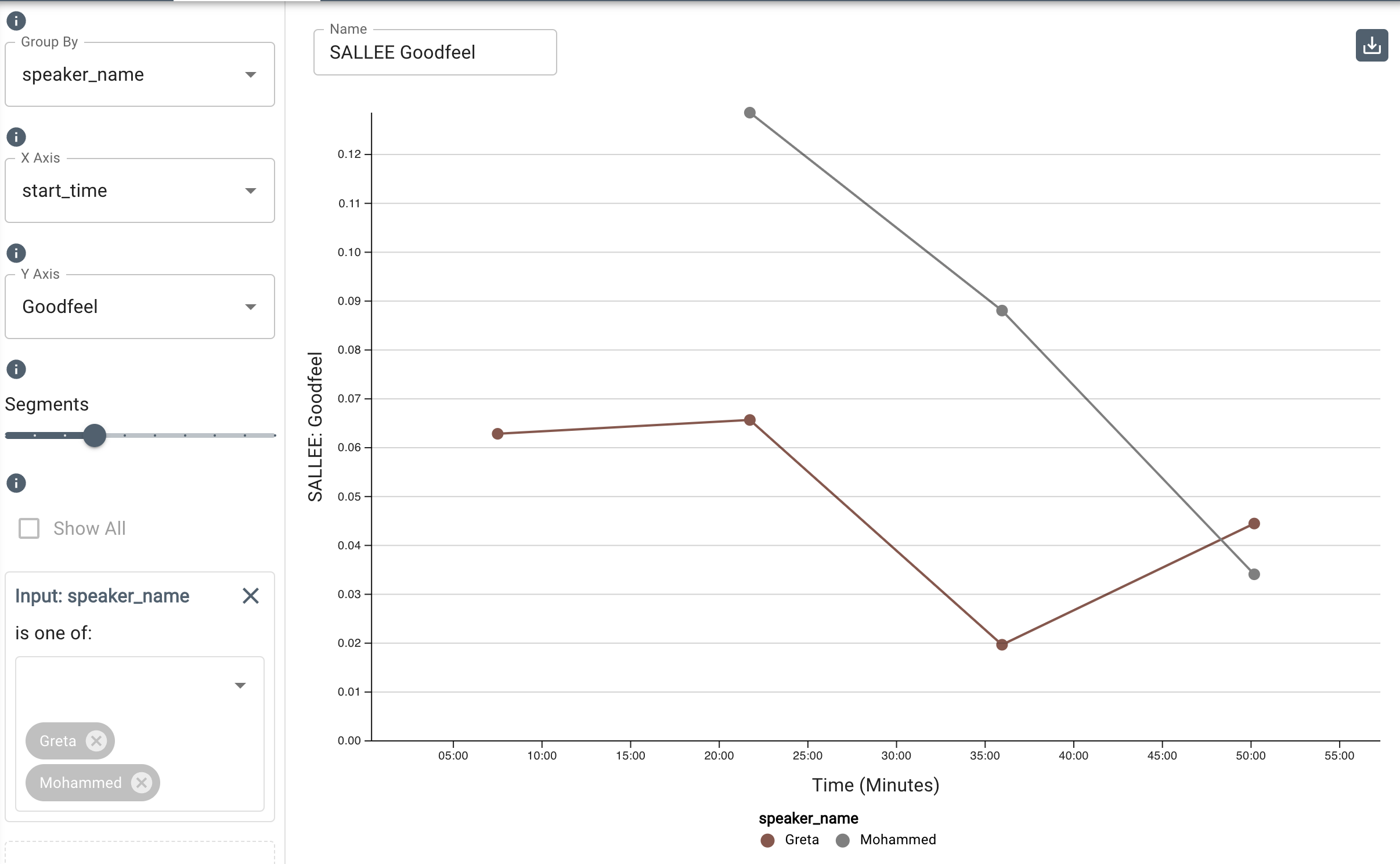
If you filter by Overall Dataset in the Group By field, you will be able to select multiple measures to display. The Y axis plots the average score of the chosen measures across the entire dataset over the timeframe.
-
Under
Additional Configurations, you will findOverride Axis Ranges. This tool allows you to toggle between Fit to Data and Custom. By choosing Fit to Data (the default setting), the chart will scale to the upper and lower ranges of the data plus a small buffer. Choosing Custom enables you to customize the y-axis range.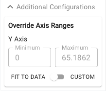
Customizable axis ranges provide flexibility to zoom in and view your data in greater detail, making it easier to analyze patterns that might otherwise be missed. Zooming out allows you to standardize the scale across multiple charts, which is especially useful in views such as dashboards where you want to compare different datasets on a consistent scale. This feature gives you control over how your data is presented, ensuring that key insights are clear and accessible.