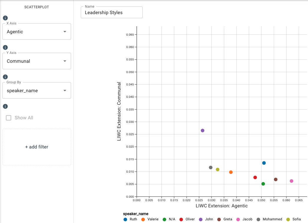
Scatterplot
This chart works well for combining two measures on the two axes for multiple categorical data points such as participants in a meeting. The dots represent a comparison of the aggregates of the two selected measures.
By using the scatterplot, you can compare the average score of the mean of the two measures, identify how correlated two measures are (positive correlation, negative correlation, uncorrelated), and identify outliers in the dataset.
Other useful categorical data variables to filter by with the scatterplot are gender, office location, age, and tenure, among others.
Parameters
- The X-Axis and Y-Axis drop-down menus allow you to select a measure from the available frameworks so you can see how the different speakers varied emotionally and psychologically throughout the duration of the conversation. The dots represent a comparison of the aggregates of the two selected measures. You can type in this field to search and select an existing measure.
- The Group By drop-down menu allows you to set the column to use to group the chart’s data by selecting either the overall dataset or by a category such as
speaker_name,speaker_id, or any category your dataset is labeled with. You can type in this field to search and select an existing category. - The Add Filter option allows you to further filter by categorical input data. For example, if you had many speakers in a meeting and wanted to view the data for a smaller subset or single individual, you could filter them here by clicking Add Filter and selecting your desired input value(s).
The dots will be empty circles for participants whose word counts are too low for valid normed scores.
-
Under Additional Configurations, you will find Override Axis Ranges. This tool allows you to toggle between Fit to Data and Custom. By choosing Fit to Data (the default setting), the chart will scale to the upper and lower ranges of the data plus a small buffer. Choosing Custom enables you to customize both the x-axis and y-axis ranges.
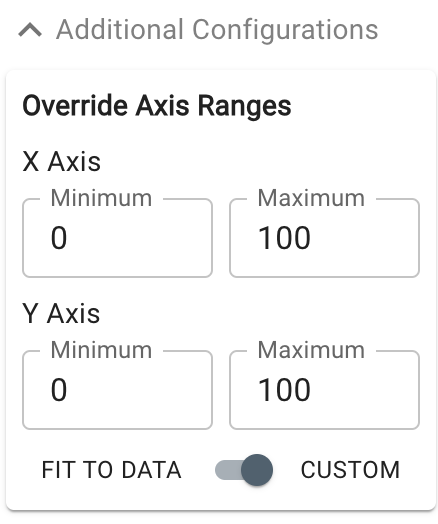
Customizable axis ranges provide flexibility to zoom in and view your data in greater detail, making it easier to analyze patterns that might otherwise be missed. Zooming out allows you to standardize the scale across multiple charts, which is especially useful in views such as dashboards where you want to compare different datasets on a consistent scale. This feature gives you control over how your data is presented, ensuring that key insights are clear and accessible.